Aïcha Fall
|
Aïcha Fall is a storyteller who tells her story through each photograph she creates.
Her project 'A Seat at The Table' was made to narrate black bodies and showcase how beautiful black bodies could be just existing. She used her iPhone as her camera and took a series of photos in her father's garage, using things from her house (examples are her mother's curtains, a rug, etc) |
|


Delfina Carmona

|

|
Delfina Carmona is a photographer that uses natural sunlight and shadows to create an image. The focus of her photography is usually in the sunlight, and shadows, such as blinds or hands, etc, are cast to add depth to the photo and also shows us what is 'hidden', outside the frame of the photograph.
She believes that 'Equipment does not to the job alone. True wonders can be achieved with the bare minimum' - a quote that i have kept in mind, as i agree with her. |
Larry Sultan.
WHAT DRIVES ME TO CONTINUE THIS WORK IS DIFFICULT TO NAME. IT HAS MORE TO DO WITH LOVE THAN WITH SOCIOLOGY, WITH BEING A SUBJECT IN THE DRAMA RATHER THAN A WITNESS. AND IN THE ODD AND JUMBLED PROCESS OF WORKING EVERYTHING SHIFTS; THE BOUNDARIES BLUR, MY DISTANCE SLIPS, THE ARROGANCE AND ILLUSION OF IMMUNITY FALTERS. I WAKE UP IN THE MIDDLE OF THE NIGHT, STUNNED AND ANGUISHED. THESE ARE MY PARENTS. |
|


Mark Power and Olivia Arthur - HOME project.
|
|
|
.
.
.
.
.
.
.
.
.
.
.
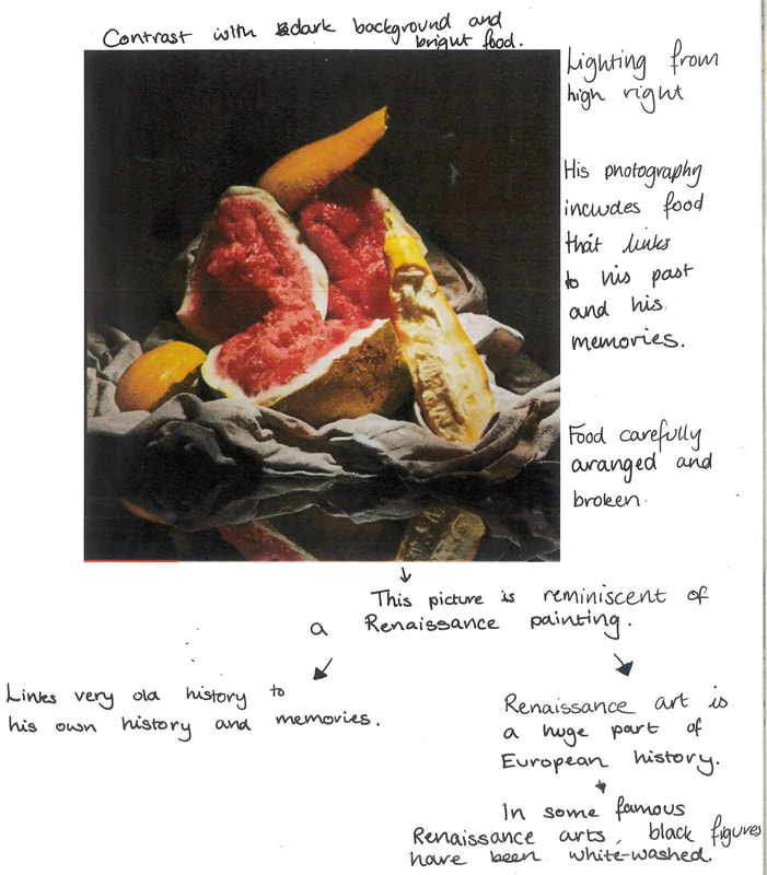
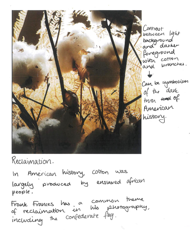
Frank Frances

|
His series of work relates to the theme of 'Home' as he explores his culture and his experiences in the photographs, and includes objects/items he grew up around. His photography including food, for example, is a representation of his memory of his grandmother's cooking.
He also uses his art to explore the trauma and effects of racism as he grew up, and he has even taken racist symbols into his own work as a way to 'reclaim' it. To respond, I would use meaningful items to me, such as a phone, headphones, and old pictures or items that I have good memories with. I would specifically choose these items as it mixes current me and my current memories with the past me, with memories of the past. It would be a way to symbolize me as a whole and how i have changed throughout my life so far. |
|
|


I created a series of photographs inspired by Frank Frances' still life pieces. I noticed that his photos resembled Renaissance paintings, and used my phone camera and lighting to make my photography resemble the paintings as well.
When setting these photos up, I carefully and deliberately spiralled the headphone wires and phone charger wire in the measuring glass, and placed the pumpkins in that. I wanted to make it seem like the headphones had 'grown' and that the wires were the roots and stems.
As well as this, I carefully moved and folded the fabric around the objects to add depth and contrast to the photo, whilst also making it pleasing to look at.
The two photos below are my two best from this photoshoot.
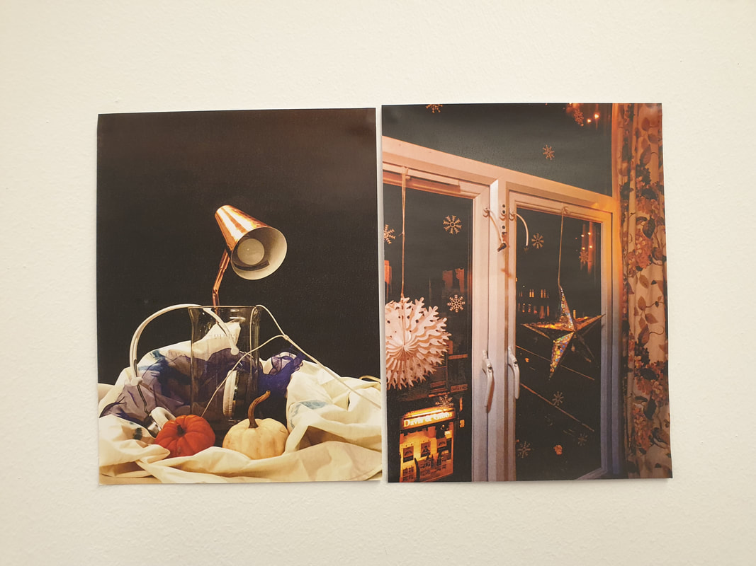
These photos are my best photos from this shoot because for one, they are the higher quality pictures of the shoot. As well as that, the still life images have objects that relate to home, as it includes headphones, something I use daily, and pumpkins, as my family enjoy halloween and we still have small pumpkins outside of our door. I used the purple fabric in one of the photos as that also links to me and my home, as purple is one of my favourite colours.
I also like the contrast, as the first one looks carefully structured and placed, whereas the second image looks somewhat natural, like objects thrown down on a table.
I also like the contrast, as the first one looks carefully structured and placed, whereas the second image looks somewhat natural, like objects thrown down on a table.
1st assignment


Niall McDiarmid


- Why do you think that the series took so long to photograph?
- What elements within the photographs tie them together as a sequence of images?
- If you could choose two visual elements within each image that the photographer has chosen to focus on what would they be?
- Which is your favourite photograph of this series? Why did you choose that photograph?
- What questions would you like to ask the photographer about this series?
Something I find interesting about Niall McDiarmid's work is that it has very vibrant yet older feeling colours. His work reminds me of work from 1960s ads, with bold colours.
I think these photos are staged/composed. The items in the photographs are arranged in a way it looks 'naturally unnatural'.
I feel like the concept behind these photos is to capture home in a nice and appealing way, sort of like how memories seem to always be nicer looking back rather than actually experiencing them, as it holds a sort of nostalgia with it. I noticed that almost every photo here contains a coffee mug, which might imply that a lot of coffee or tea was drunk in his household. Another similarity is the colours used in each photo.


Diptychs - Postcards from home


Both of these photos were taken at 2am in the kitchen - where it was mostly dark but I used the light from the Kitchen Hood to light the kitchen so I could see (photographed on the right). I enjoy this diptych as there's a lot of contrast and interesting colours.


The first picture was taken outside of my house, as I noticed rubbish had been dropped against the (HABABABA)
I then chose the second image to finish the diptych as I thought it was quite similar to the first, as there was one last present just left under the Christmas tree, by the trunk of the tree.
I then chose the second image to finish the diptych as I thought it was quite similar to the first, as there was one last present just left under the Christmas tree, by the trunk of the tree.


I picked these images to put together to make a diptych as I noticed there were similar shapes in the photographs. As well as this, there are common themes like lights (lamp and fairy lights), wires (headphone wires and the wire of the fairy lights), the fabric (draped fabric in first image, and the curtains in the second), and nature/plants (the pumpkins and the tree).


I chose these to be a diptych together as when I was looking at them, I thought they were very different but had similarities. The first image has a black board that is cluttered and full of face masks, and the second one is similar, showing many cars on a road.
However, this is one of my least favourite sets, as the images themselves are very different in style and colour.
However, this is one of my least favourite sets, as the images themselves are very different in style and colour.


I chose these two photos for a diptych as I feel like it tells a story - The magic of Christmas night versus the week of nothing after leading up to the new year. After Christmas, the trees are packed away into an attic or cupboard or thrown out on the street, so I felt that the two images had a huge contrast.


These images as a diptych were interesting to me, as there are multiple common things within the photos, yet they are both so different.
The first image is definitely warmer tones, the sun creating a glare on the camera, and is taken outside, however, the second photo is taken inside and has a lot more cooler tones within the photo.
I like the similarities each photo has, with the large amount of lights in the photo, as well as the flower common in both and the plants around them.
Final Combinations.


These photographs were chosen for my final choices because I enjoyed everything about creating them. They both were taken around the same time on the same day, around 2am, in my kitchen.
The contrast of the shadows and light, and how they both can warp a way we perceive different objects and places, is really effective in making an interesting diptych.
The contrast of the shadows and light, and how they both can warp a way we perceive different objects and places, is really effective in making an interesting diptych.


I also decided to create a triptych for my final choices to create some variation, and I thought the three pictures above went together quite well. The far left and far right images link as I found that they have similar layouts, with the pole, t
.
.
.
.
